JRC
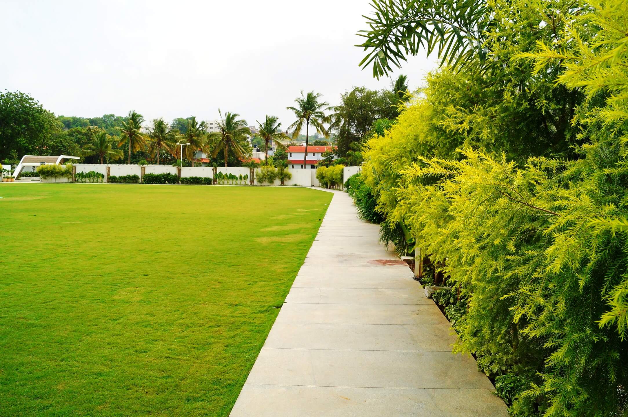
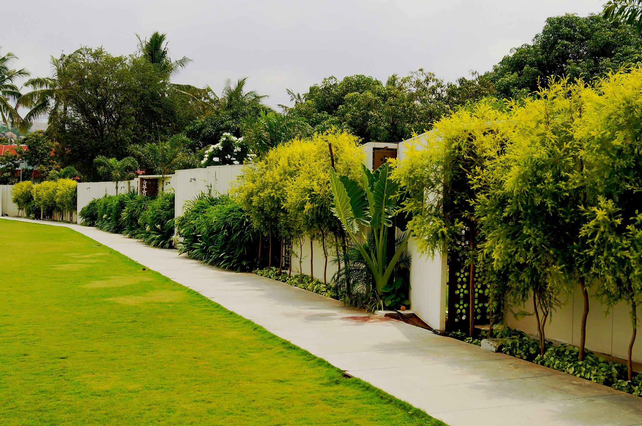
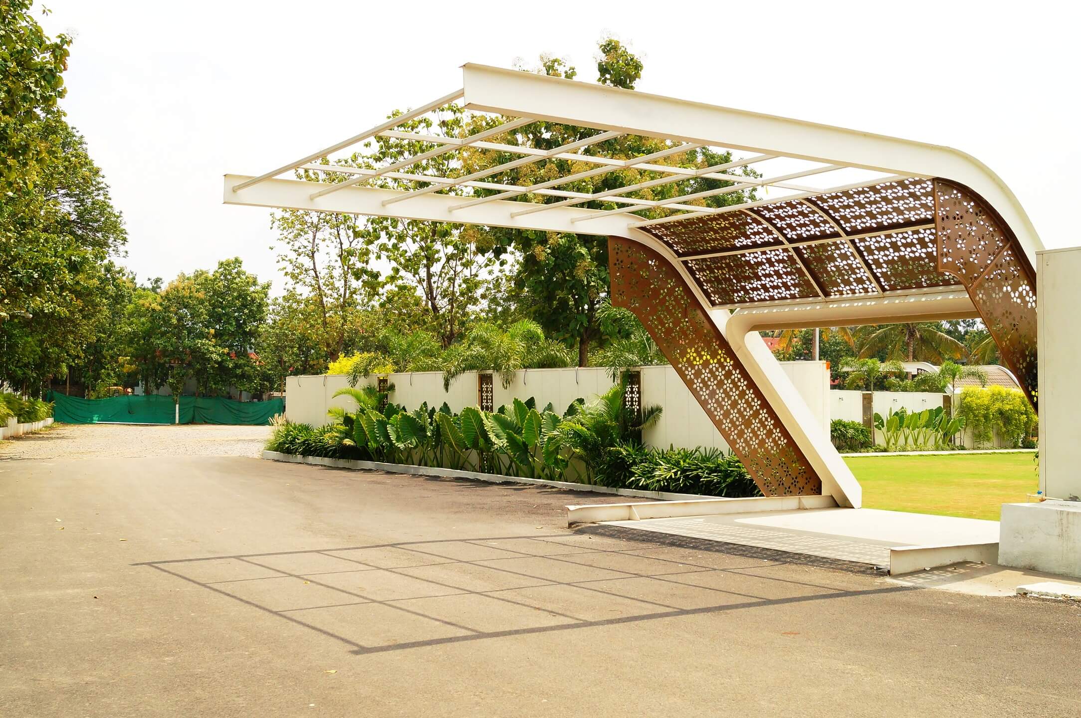
A haven for your events, intimate gatherings and moments of celebration, JRC was designed with white being the star of the colour palette to maintain an open demeanour for people to be able to use the space with the freedom to create an experience of their choosing, without being constrained by the striking nature of the colours we used. We wanted to create openness and an inviting feeling in the whole space, and the design thinking does exactly that. Upon entering the lawn, the area has been intentionally fragmented across the boundary with the help of screens. We played with abstract geometry to merge this approach with the integrity of the elevation.
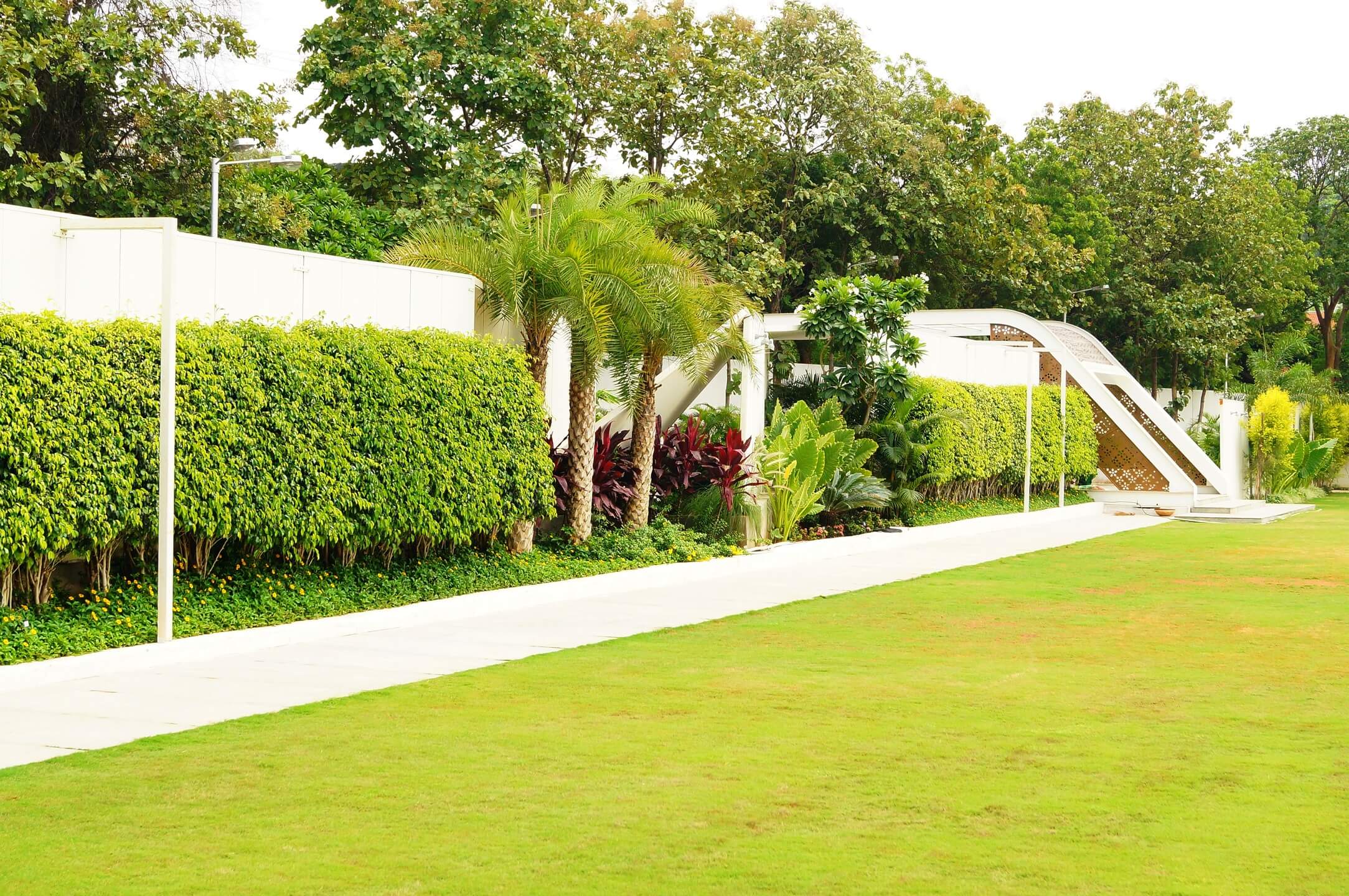
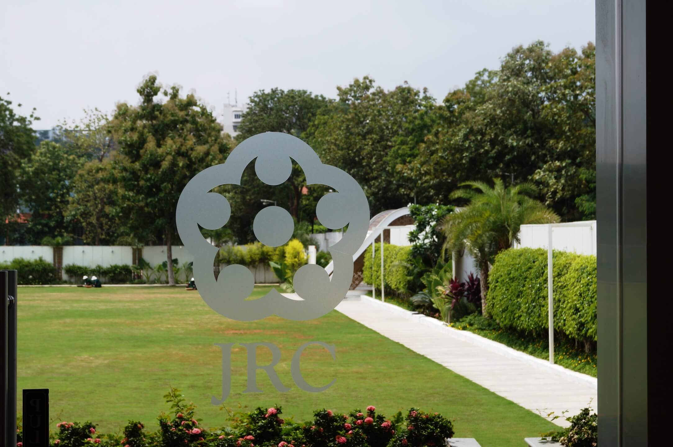
The major design evolved with the façade and elevation, the logo was designed taking inspiration from motifs that were used on frames near the entrance. We aimed to maintain this continuity across the property, and the pavilion area was designed in a way that it was typically subdued with the shape and form of the elevation that surrounds it. The logo motif with intricate metal stencil work, combined with a cotton steel effect has been intentionally chosen to break the monotony from the whites used in this space.
Everything about this project is so deftly interwoven and linked, you are able to create a beautiful harmony between the screens, plantation and walls all running together.

