R-Backyard
R-Backyard
This project was born as an extension of an existing Club. We worked with a space that was set to house a live performance stage, with open seating, and impeccable decor. We had to design elegance out of the rough edges of what was available, within the humble budgets at hand. Putting our minds to task, we made it a point not to waste the available rubble, debris and even recycled glass bottles in our redesign approach to make it cost-efficient.
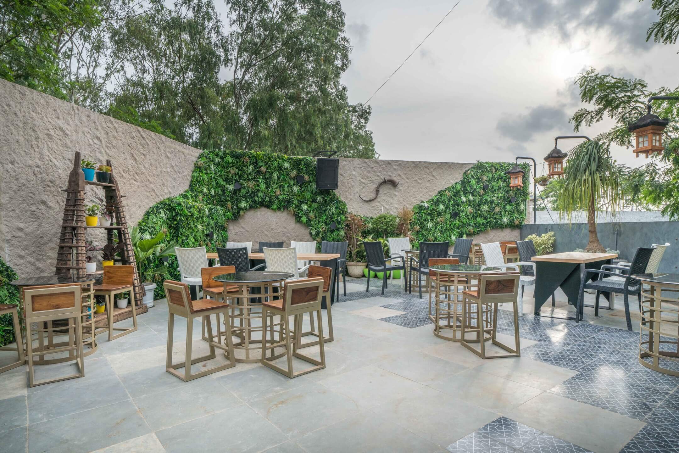
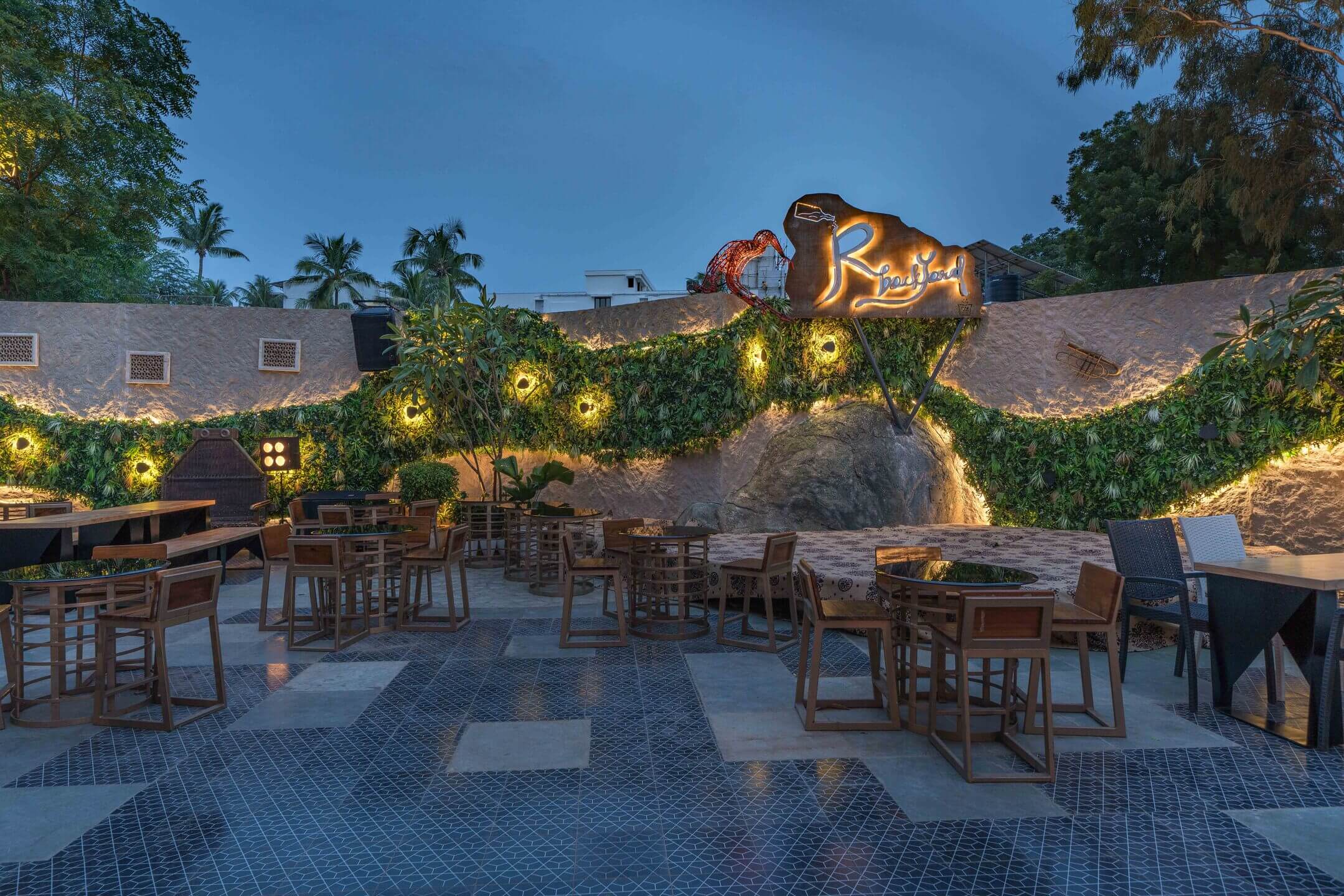
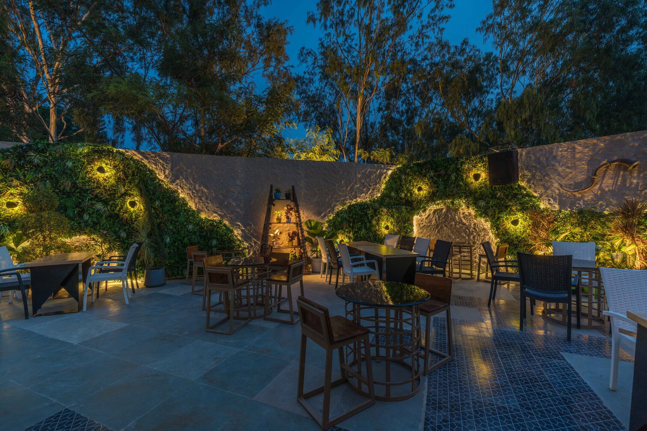
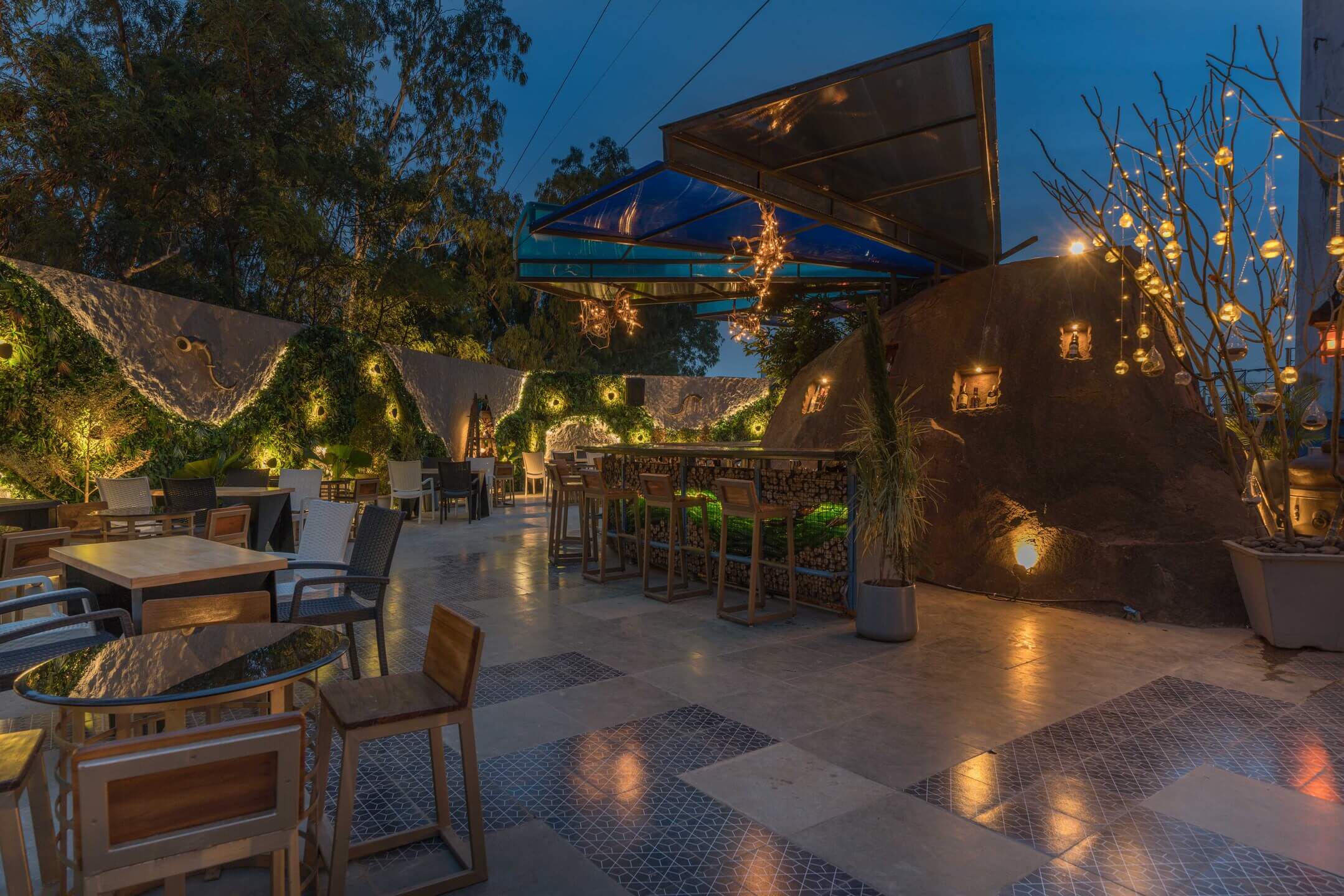
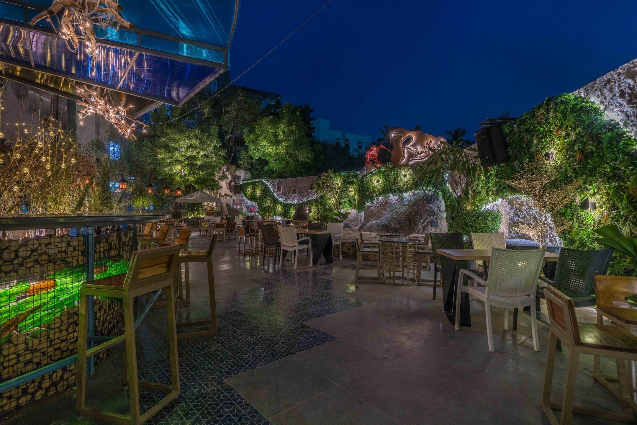
Inspired by natural rock-scapes, we used the outline of the natural boulders from the site to create the green outline that runs along the wall as part of the boundary. The existing boulders that were scouted from the site helped us enhance the space so we could make the walls themselves a feature. Warm, open seating allows people to intermingle with ease without feeling blocked in.
The bar counter, built using the reused, discarded beer bottles was placed artistically within a frame, then accentuated further using backlights and then juxtaposed against the existing boulder. Giving the premium liquor bottles a space of their own, we carved pieces of it to display the bottles. The bar set against the existing boulder, along with the coloured roof canopy branching from the boulders makes this a sight to behold. 60% of the scrap and raw material already present at the site was re-used, including waste beer bottles, iron sheets and more.
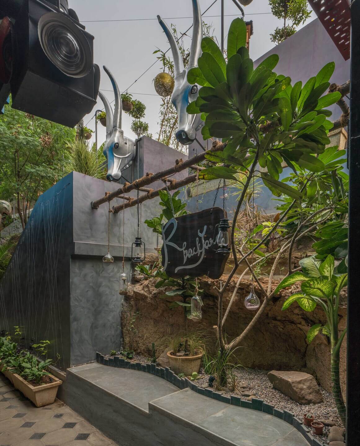
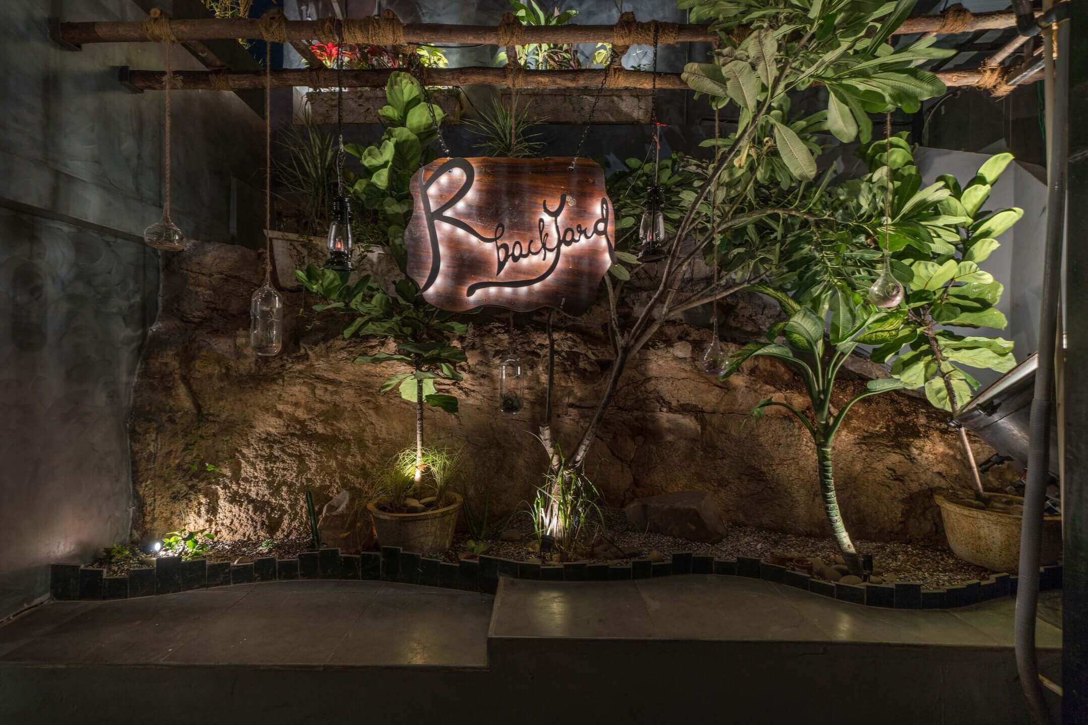
Upcycled beer bottles were used to craft the bar and the wooden logs at the site were used to make the suspended signage at the photo booth. The main signage over the Live Band Deck was made from Iron Sheets with CNC cutting, and we designed the signage to look like a bottle of beer pouring into a glass. Detailing like this sets us apart from the rest, whilst we go deep into the mood and persona of the place we are designing.
With Balinese lanterns lighting up the seating area, we used up aesthetic looking branches from a fallen tree at the site, and fashioned a pendant light from it. Old railway lanterns were also used to light the entrance pathway. Every site is a challenge, and this, was a mammoth task. We had to create a sculpted nook within existing rocks, and the proposed staircase, with a signage suspended from the ladder above, with a dry garden under it. Potted plants flanked the passage, leading the way to the steps. While the organic form served as an inspiration for the Green Wall, the skewed Geometric Lines intersecting with the Rocks served as an inspiration for the flooring.
We believe that necessity is the mother of invention, coupled with there is beauty in everything. Putting the two philosophies together made us the masters of our fate during this project, and safe to say, we have delivered. As designers, we had to spend a long time preparing ourselves and crafting a true vibe that not only was vibrant and unique in design, but also exuded character and openness. Needless to say, our involvement in the decor, artifacts and selection of material played a significantly important role in the design.

